T-SHIRT COLLECTIONS
Gucci Kroger: A fundraising design for an interesting slang term used in the small college town of Blacksburg, Virginia.
START UP
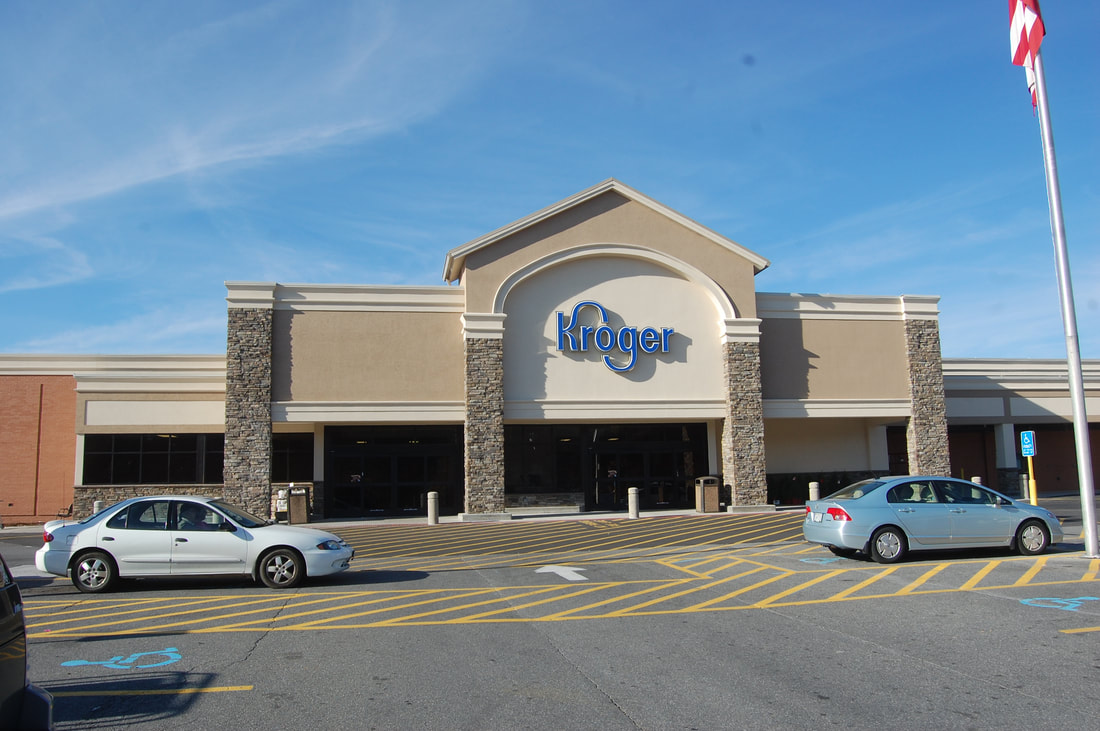
"Gucci Kroger" is the term used for the 'better' Kroger grocery store of the two that are located in town. This better Kroger is open 24 hours a day, and is about twice the size as the other one. The only problem is it is a little further away from campus and provides less of a convenience than the other.
|
However, it became such a well used term that the Virginia Tech Rotaract Club wanted to make an outspoken t-shirt to raise money for their organization.
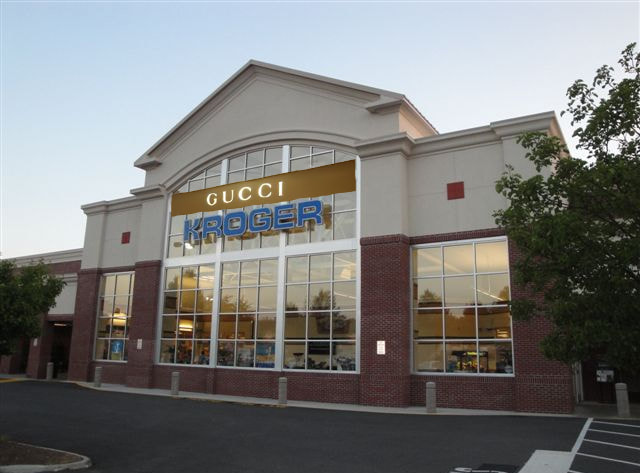
They asked me to design something that would look "gucciesque" or designer, so that it could play off of the original idea of a better Kroger. The comparison of the two stores is to the right. The Gucci banner was photo shopped onto the picture by the many fans. |
|
DESIGN
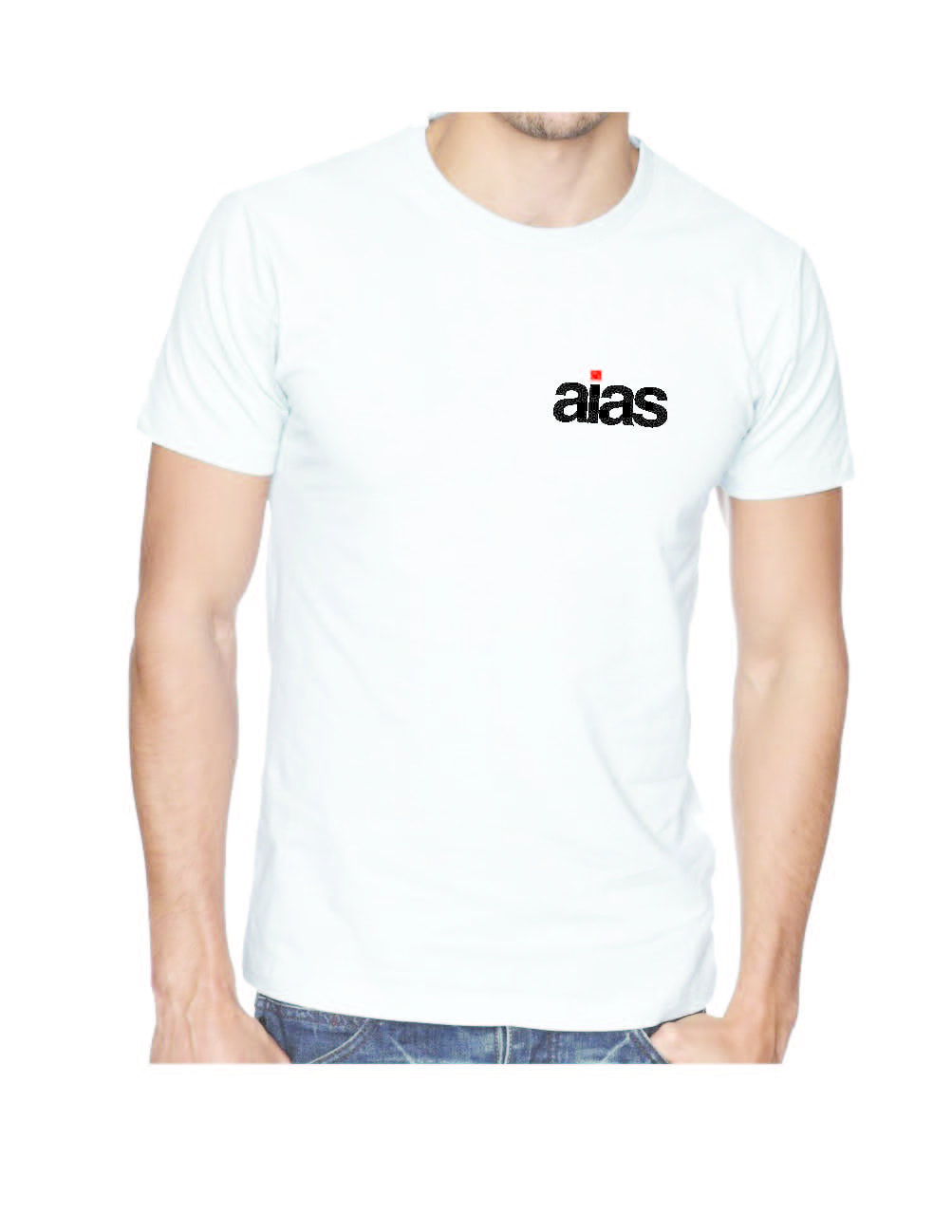
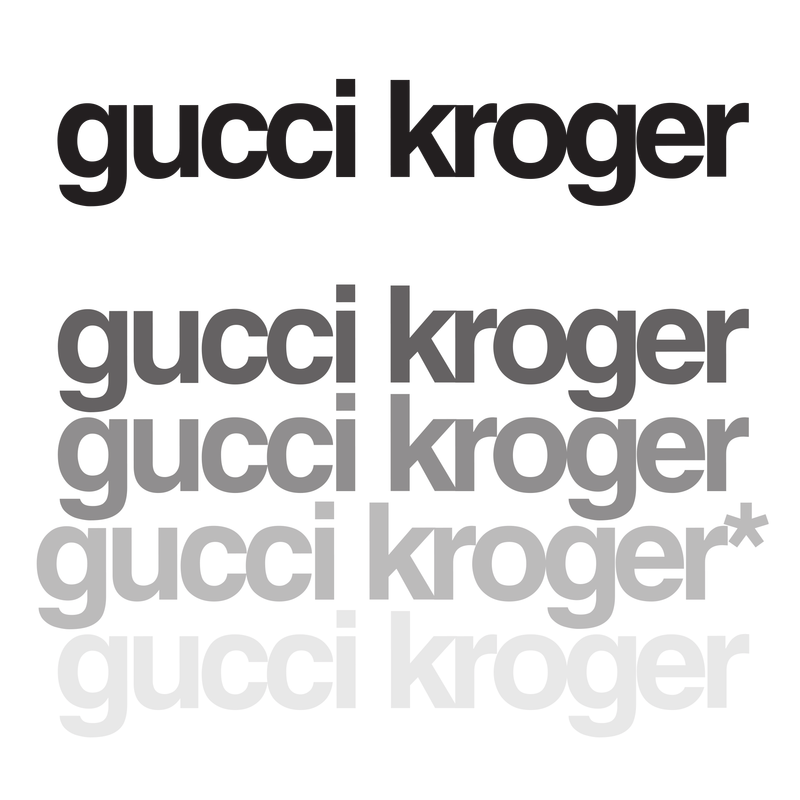
Since I wanted it to be a simple shirt, I looked specifically to use or make a good font that would fit the style.
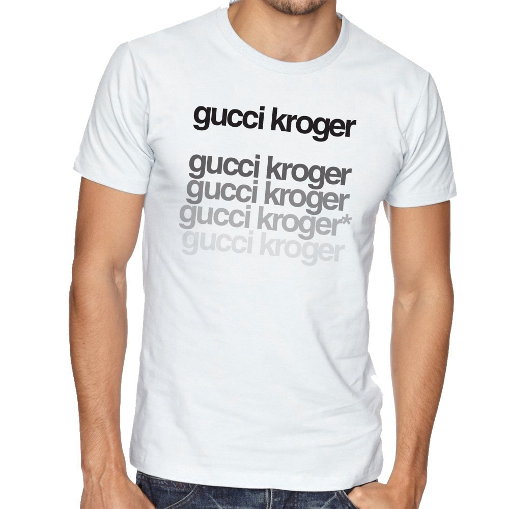
|
I picked out a sans serif font, and tweaked the spacing of the letters, thicknesses, and layouts of the words Gucci Kroger. I decided to keep it simple like most expensive brand names do, and placed the words onto the shirt. I only gave it the repeating texture to make the shirt not seem too simple that it was trashy. I also added an asterisk to the 4th line as a compositional move and to leave an underlying "correction" as if someone was telling you, "It's 'Gucci' Kroger". |
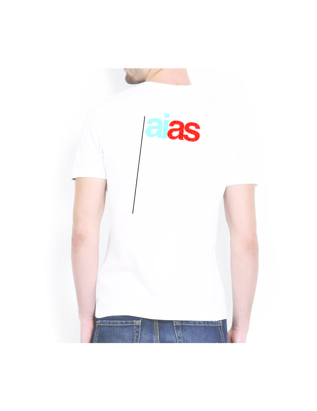
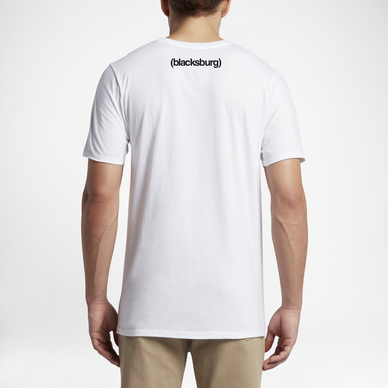
And of course, to add that sense of pride, and to "add" to the quality of the shirt I stuck a Blacksburg logo on the back to not overcome the shirt, but to leave a sense of care and expense into the shirt. The back is as shown.
|
|