
COLOR
An introduction to the use of color, color palettes, and the interaction of color.
The following is a brief introduction to understanding how color works with other sides of the color wheel and how harmony can be achieved with matching pairs. This can be a very unique and rare design tool.
Exploring color, for me, started with finding a collection of over 10,000 shades and palettes from a design book at a library. These colors were very unique, very bright, and had different qualities at different distances, light sources, and comparisons.
I began by taking two colors and matching them over and over again as if to find some middle color. It was easy at first, until I started to chase the idea of matching very unique colors and finding the one in the middle. I decided to optimize them in 1 1/4 in. squares within 6 x 6 in. compositions.
COLOR PALETTES
|
|
These here are two different compositions, one with a slight grey background, the other on clean white.
The values are also darker in each square on the left, except doubled on the left middle square comparatively to the right middle square. Also, the colors are switched from orange on top and bottom to orange on left and right. At first glance, they may seem identical, but after identifying the differences, you can see how big of a difference color can make. |
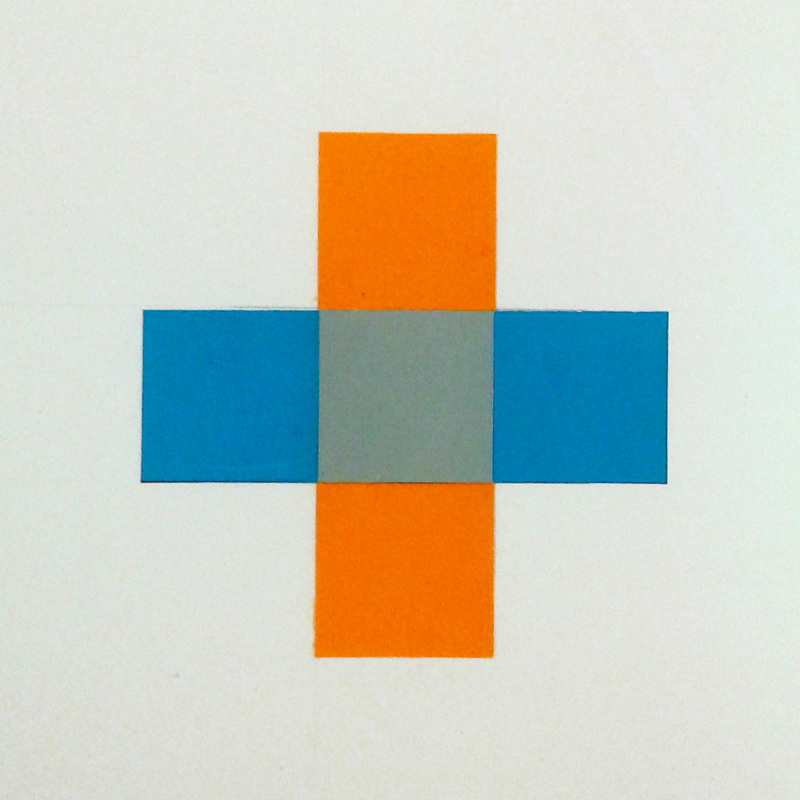
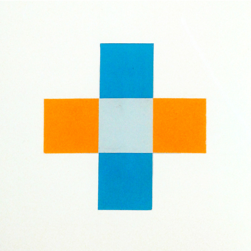
As I said earlier, I chose the middle color based on the fact of what I think would look like an overlap of two. Think of it like a plaid pattern.
The problem is that I tried to use two colors that were on the complete opposite sides of the spectrum, and the complimentaries created a grey. So to summarize, it was difficult to choose a correct color to fit the middle of the composition, but if you squint your eyes or stare without focus on the compositions, you can see the overlap. The overlap is much more prominent and visible in the first composition.
The problem is that I tried to use two colors that were on the complete opposite sides of the spectrum, and the complimentaries created a grey. So to summarize, it was difficult to choose a correct color to fit the middle of the composition, but if you squint your eyes or stare without focus on the compositions, you can see the overlap. The overlap is much more prominent and visible in the first composition.
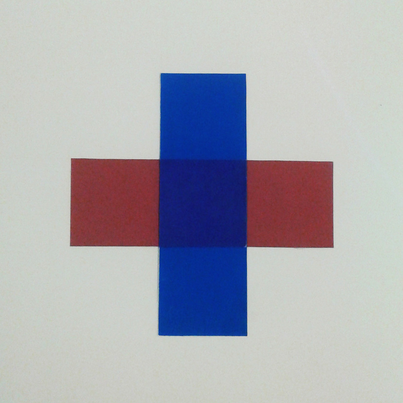
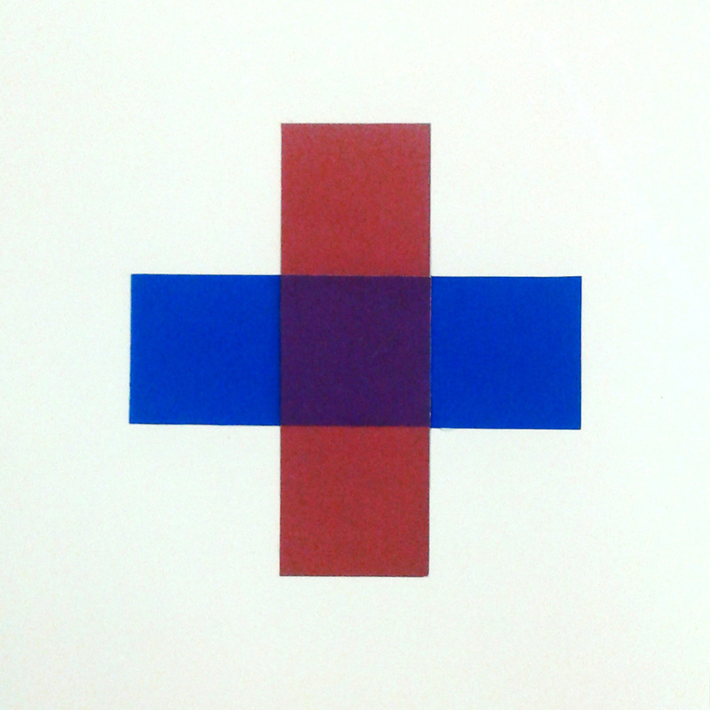
Here is another test I tried with colors that are closer to each other on the spectrum.
|
Again, I worked with a slightly grey background for the first composition. The colors are also flipped from up and down to left and right (and vice versa). The middle color I chose for both of these compositions was very powerful compared to the first iteration however. They create a really amazing sense of overlap for both pieces, in which the left has a blue overlap and the right could be seen as either one, however it also leans to a blue overlap. |
|
These little tests were less of a project, and more of a small demo on learning about and understanding how color works. I learned more about color ranges, and this I would take into consideration when incorporating design elements in further projects as a foundation. My next move was elaborating on my cube, as every model I had created (excluding the cardboard ones) was pure white. White was good to show shadows and serve as a neutral platform for your mind to perceive the space, but now I was looking into moods and styles.
APPLICATION TO BOXES
|
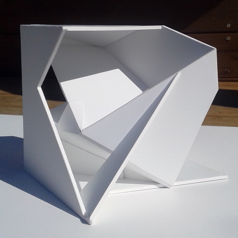
I took pictures of my latest and final iteration of my cube out on a really bright and sunny day, and examined the shapes, edges, and shadows it created.
A good thing that I realized when taking my model outside was that it was reflecting colors from it's environment. A girl had passed by with a red shirt and I saw the faint red light in the box. This light was very beautiful for the split second in which it was there, and ideas sparked in my mind. I was trying to explore color, and the way it could enhance my cube so I decided that I would reflect my colors onto my cube. I took this picture as my reference side, and started to create sketches of it, while shining different color pallets onto the surfaces in the studio. I came across a couple of colors that I felt explained and represented the angles and geometry that takes place in my cube. |
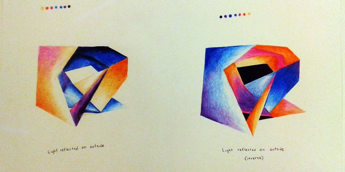
This was my first set of sketches with the color pallet I found. It was that modern/futuristic galaxy type of color combination that I felt really made sense with how the cube was made.
|
Of course, the reflections of the color shades that I had been setting next to the cube weren't as exaggerated as they were in the sketches, but I did it on purpose to find the style and understand the piece at a better point of view.
The first sketch has the warm light reflected on the outside parts of the cube while the second sketch is the inverse with the warm light inside the cube, and the cool colors being reflected from the outside. |
|
The color pallets were referenced on the top of each sketch, and they were composed with colored pencil and layering techniques.
I felt that the piece looked better with the cool inverse of the first sketch, keeping the warm center in the hearth, and I felt that my piece did incorporate this type of style. It was great, I had found a way to use color to my design advantage, and so I went on to create a rough draft composition in small scale.
I felt that the piece looked better with the cool inverse of the first sketch, keeping the warm center in the hearth, and I felt that my piece did incorporate this type of style. It was great, I had found a way to use color to my design advantage, and so I went on to create a rough draft composition in small scale.
COMPOSING AND OPTIMIZING
|
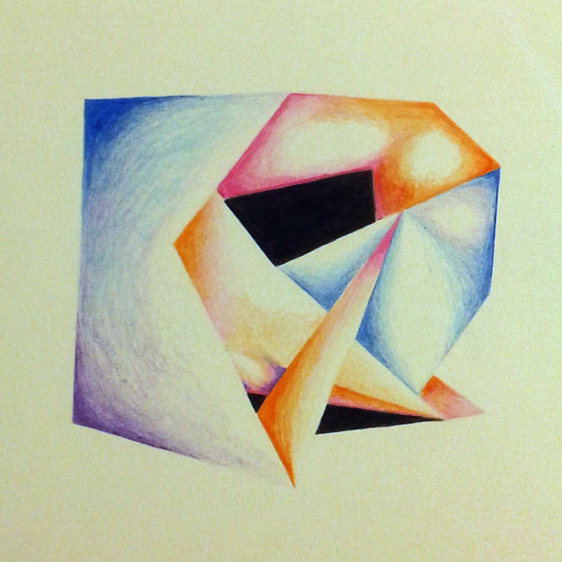
I used a lighter approach and less exaggerated shading to give a more realistic approach to what my cube was looking like when I was reflecting my color samples. I also used hard black as my neutral since I had white as an absence of color and I tried to create hard edges to make up for the absence of color at intersections.
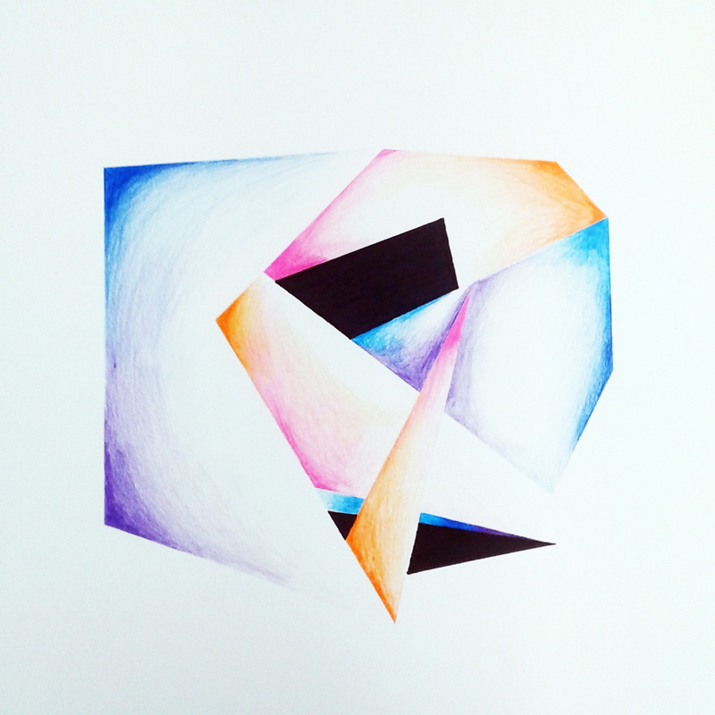
I kept my cool color approach and the black was also a good way of showing that it was a cooler object. I then went on to take this draft and create the final. The final had less exaggeration, came closer to what the actual cube looked like and was made on a bigger sheet of bristol board paper. It was almost actual size at 8x8 in. and it had harder and cleaner edges because I used artist's tape to mask edges when shading with the colored pencil. |
|
The final composition is displayed below.
|
|
|
|
