
LINES
The concept of this project was to create the first foundation on learning true abstract design.
The work displayed is the finished work of multiple iterations of different compositions, all in order to create a finished piece.
The work displayed is the finished work of multiple iterations of different compositions, all in order to create a finished piece.
|
|
The lines were created with straight edges and compasses. Concepts such as the incorporation of white space, overlap, composition, parallelism, and weight were used to accomplish a sense of variety.
Variety can help your eye interact with the piece in a dynamic way, evoke a flow of movement, and keep your focal point dancing around the page, without being too much to the point where the piece is aggressive and heavy. |
The prints that you see are optimized prints, nonetheless prints, and were created by hand. Materials used were 4 different types of graphite pencils ranging from 6B to HB, straight edge ruler, compass, 0.1 and 0.3 mm felt tip pens, fine tip inking markers, and used on a
2-ply bristol board medium.
2-ply bristol board medium.
These compositions however were optimized in Adobe Photoshop, to have better digital compatibility and appeal.
|
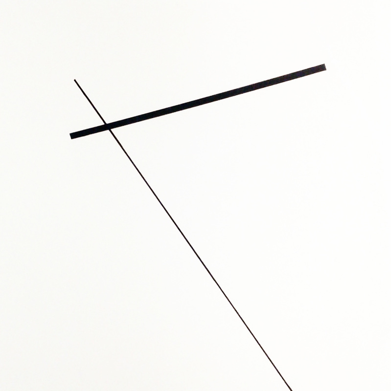
These compositions had thicker lines to evoke an emotional punch or hit to the eye.
The bold placement in the piece is used to add an accent and focal point while extruding away from the eye's first glance. Parallel and perpendicular lines can be dull and repetitive on the eye, but tweaks in the composition of other or the same lines can add the dynamic sense that can place one good composition over another. |
|
|
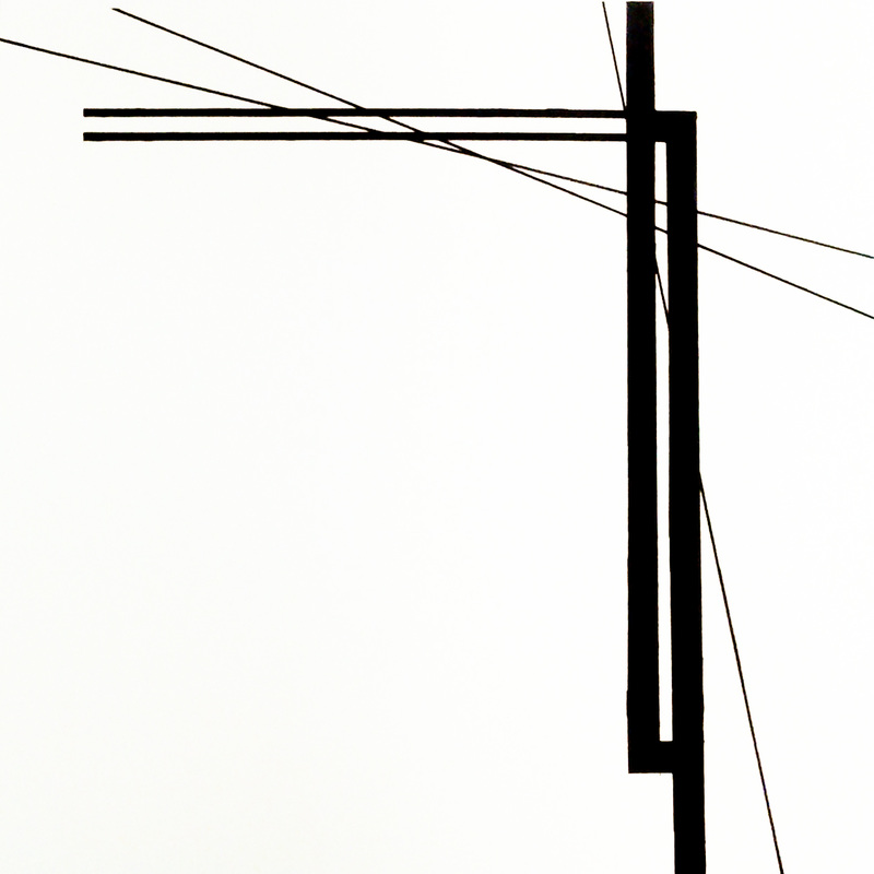
The piece on the left is a bold set of rigid perpendicular and parallel lines, intersected with thinner diagonal lines, flowing through to add a sense of eye movement.
Other examples of the techniques described and used are shown below.
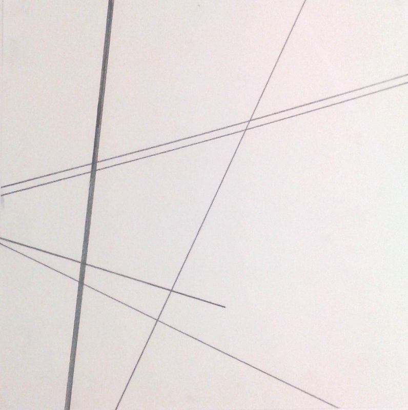
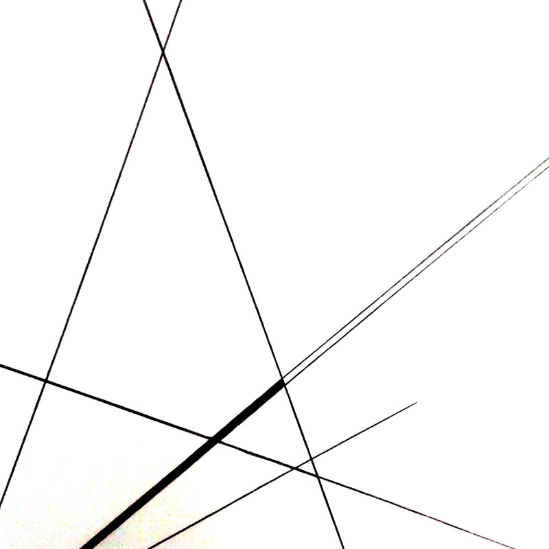
Graphite pencil composition
One thick line and 1 set of parallel lines 1 incorporation of dynamic white space |
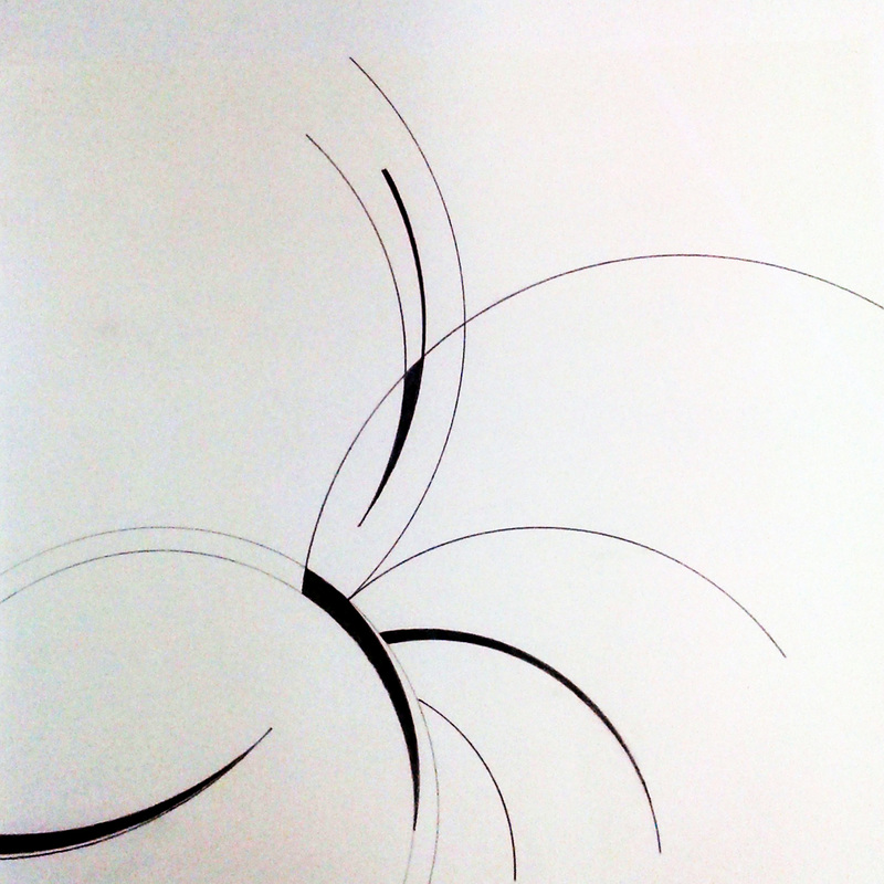
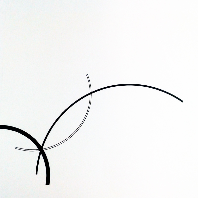
Ink composition: 0.1 + 0.3 mm felt tip pens
Tracing done with a compass 1 incorporation of flowing white space |
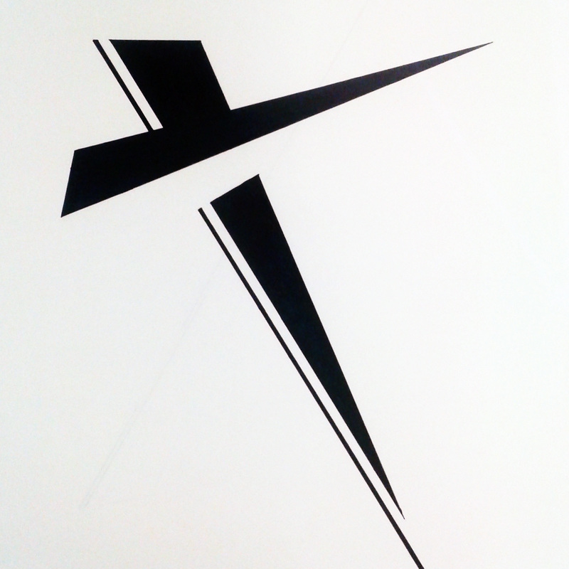
Ink composition: 0.3 mm pen + sharpie
Final composed after 24 iterations 2 shared incorporations of white space |
Concluding this project is the awareness of overall composition for a good foundation in design.
These line drawings have inspired models and ideas that can be displayed on this website.
These line drawings have inspired models and ideas that can be displayed on this website.
|
|
